DEFINITIONS
BRAND IDENTITY IS THE WAY THAT A HORROR BRAND IS ESTABLISHED AND RECOGNISED. EXAMPLES OF BRAND IDENTITY INCLUDE THE TYPOGRAPHY, IMAGE, KEY CHARACTERS OR OBJECTS USED FREQUENTLY THROUGHOUT THE FILM.
SYNERGY IS THE CO-OPERATION BETWEEN TWO OR MORE ENTITIES TO PRODUCE AN OVERALL FINAL PRODUCT. EXAMPLES OF SYNERGY INCLUDE A FILM CONGLOMERATE SUCH AS DISNEY WORKING WITH DIFFERENT ARTISTS FOR A SOUNDTRACK, OR PERHAPS A GAMES COMPANY TO PRODUCE AN OFFICIAL VIDEO GAME FOR THE FILM. THIS IS NOT EXHAUSTIVE HOWEVER, AND THERE IS A MULTITUDE OF WAYS THAT SYNERGY CAN OCCUR WITHIN THE FILM INDUSTRY.
CROSS-MEDIA CONVERGENCE IS VERY SIMILAR TO SYNERGY IN THE RESPECT THAT IT INVOLVES THE COALITION OF TWO OR MORE ENTITIES TO CREATE A PRODUCT, HOWEVER CROSS-MEDIA CONVERGENCE IS DEFINED BY A SINGLE COMPANY CONVERGING HORIZONTALLY OR VERTICALLY TO MAKE A MEDIA PRODUCT. AN EXAMPLE OF CROSS-MEDIA CONVERGENCE WOULD BE A CONGLOMERATE , AGAIN, SUCH AS DISNEY, MAKING USE OF THEIR SUBSIDIARIES FOR A DESIRED EFFECT (EX. GAINING ACCESS TO BETTER NETWORKS)
SEQUEL/FRANCHISE IS INTEGRAL TO THE SUCCESS OF A FILM SERIES. A SEQUEL IS ANOTHER FILM MADE RELATING TO THE SAME STORY AS THE ORIGINAL. ONCE A SEQUEL HAS BEEN MADE AND MARKETED, THE FILM TITLE BECOMES A WIDELY-RECOGNISED AND ICONIC FRANCHISE.
RMT EXAMPLE 1- FRIDAY THE 13TH (Cameron Elliott)
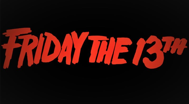
As well as sharing stark similarities to our film trailer 'The Reawakening', Friday the 13th is also a perfect example of successful and effective branding for a horror film series. An instantly recognisable title, Paramount Pictures and its respective subsidiaries have done a lot to ensure the legacy of the film and ongoing financial success of its brand, such as making a grand total of ten slasher films under the 'Friday the 13th' banner, in addition to video games, a television show, memorabilia and merchandise, as well as countless other projects.
FRIDAY THE 13TH- FILM POSTERS
FRIDAY THE 13TH- FILM POSTERS
|
|
|
BRAND IDENTITY
Any film with the success of the 'Friday the 13th' franchise must have an iconic and recognisable Brand Identity. The 'Friday the 13th' scrawled typeface font is the primary example of branding in this example, with it being used so much that the Title has become the film's unofficial logo. As well as this, is the hockey mask that Jason Voorhees wears throughout the 'Friday the 13th' film series. It has become so significant in pop culture that the character is probably more globally recognised than the actual film series. As a result, Voorhees and the mask have become a staple of merchandising and marketing for the companies in charge.
Moreover, every one of the film posters is highly conventional for the horror genre. They all feature unsettling, creepy backgrounds related to the plot of the film as well as the aforementioned hockey mask belonging to Voorhees. Interestingly enough, not one of the posters includes the protagonists or victims, showing that only the villians are marketable and appealing.
Moreover, every one of the film posters is highly conventional for the horror genre. They all feature unsettling, creepy backgrounds related to the plot of the film as well as the aforementioned hockey mask belonging to Voorhees. Interestingly enough, not one of the posters includes the protagonists or victims, showing that only the villians are marketable and appealing.
FRIDAY THE 13TH MERCHANDISE
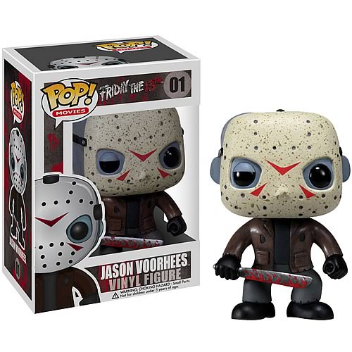
VINYL FIGURES
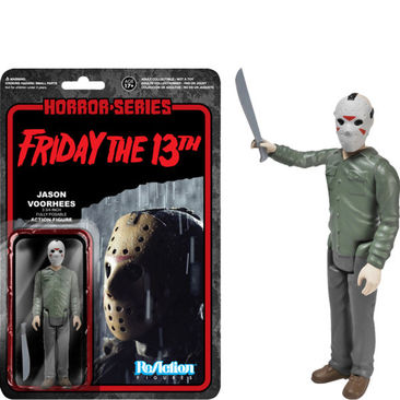
ACTION FIGURES
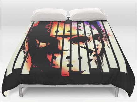
BED COVERS
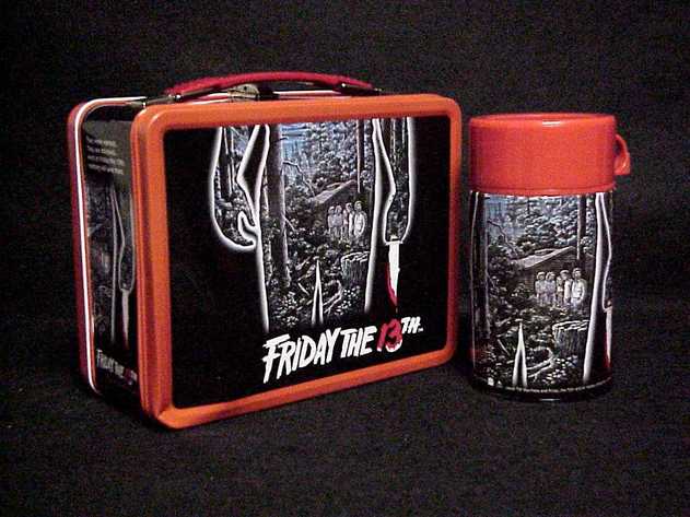
LUNCHBOXES
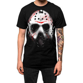
T SHIRTS
AS EVIDENCED BY THE MAJORITY OF MERCHANDISE, FRIDAY THE 13TH IS DEFINED BY THE HOCKEY MASK DONNED BY JASON VOORHEES. LIKE MOST HORROR FILMS, THE 'COOL', MARKETABLE FACE OF THE FILM IS ACTUALLY THE VILLAIN RATHER THAN THE HERO, AND THAT'S NO DIFFERENT FOR 'FRIDAY THE 13TH'. WHILE THERE'S A PROBABILITY THAT SOME OF THIS MERCHANDISE, SPECIFICALLY THE T-SHIRT, COULD BE FAN-MADE, UNOFFICIAL PRODUCTS, IT'S OBVIOUS THAT THE MASK AND VILLAIN PLAY A HUGE PART IN THE MARKETING OF THE FILM, AND MAKING IT APPEAL TO THE TARGET AUDIENCE OF 16-24 YEAR OLDS. THE WIDE RANGE OF PRODUCTS SHOWN ABOVE DISPLAYS THE HUGE MARKETING PROCESS THAT GOES ON IN THE PROMOTION OF 'FRIDAY THE 13TH', ESPECIALLY CONSIDERING THAT SOME OF THESE PRODUCTS AREN'T EVEN SLIGHTLY LINKED TO THE HORROR GENRE.
RMT EXAMPLE 2 - A NIGHTMARE ON ELM STREET (Blesson Bangula-Zola)
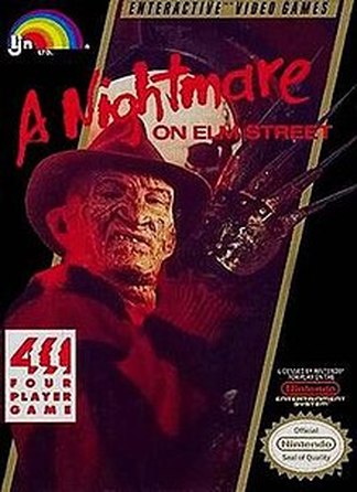
A Nightmare On Elm Street is also a very good example of successful and recognisable branding. In total, there are 8 movies in the franchise including the 2010 remake. This is one of horror's most popular movie titles and this is due to the contribution from other companies such as New Line Cinema.
A NIGHTMARE ON ELM STREET - FILM POSTERS
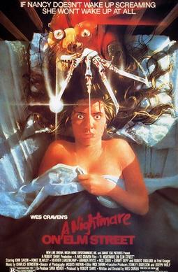
A NIGHTMARE ON ELM STREET- (1984)
|
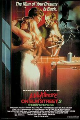
A NIGHTMARE ON ELM STREET 2: FREDDY'S REVENGE - (1985)
|
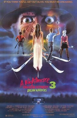
A NIGHTMARE ON ELM STREET 3: DREAM WARRIORS - (1989)
|
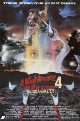
A NIGHTMARE ON ELM STREET 4: THE DREAM MASTER - (1988)
|
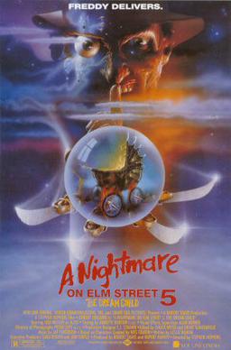
A NIGHTMARE ON ELM STREET 5: THE DREAM CHILD - (1989)
|
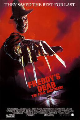
FREDDY'S DEAD: THE FINAL NIGHTMARE - (1991)
|
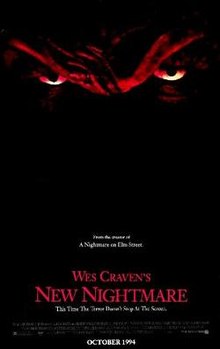
WES CRAVEN'S NEW NIGHTMARE - (1994)
|

A NIGHTMARE ON ELM STREET - (2010)
|
A NIGHTMARE ON ELM STREET MERCHANDISE
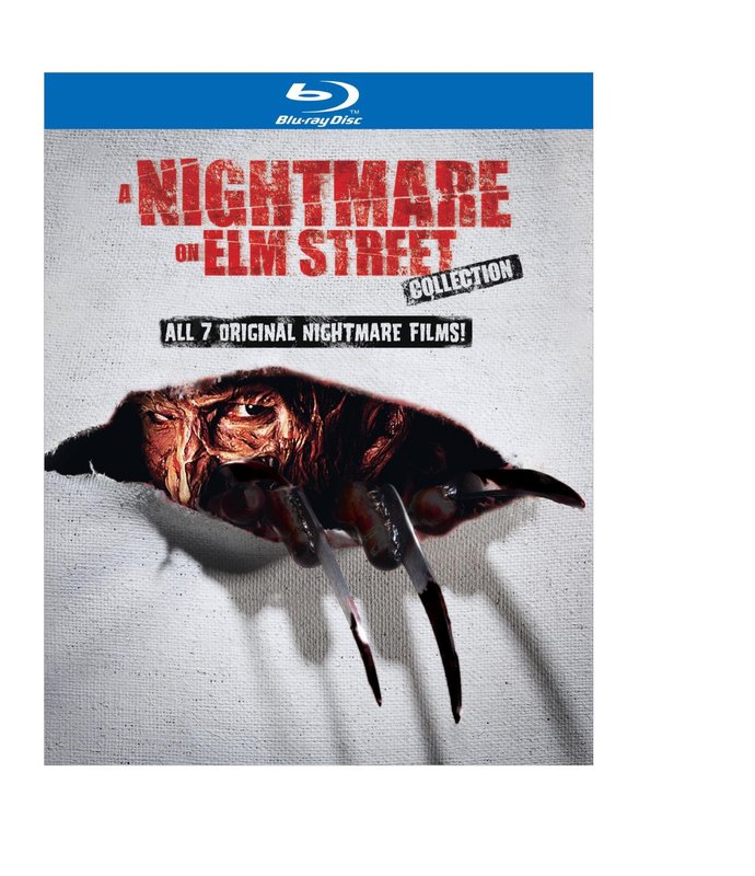
BLU-RAY DVD
|
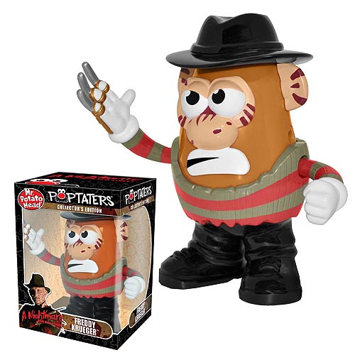
TOYS
|
CLOTHING
|
VIDEO GAMES
|
A NIGHTMARE ON ELM STREET - FILM TRAILERS
|
|
|
|
|
|
|
|
|
|
|
|
|
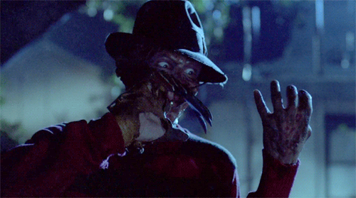
The brand identity of A Nightmare on Elm Street is normally recognised by the Freddy Krueger and his iconic characteristics such as the claws, the scarred up face and the hat.
|
|
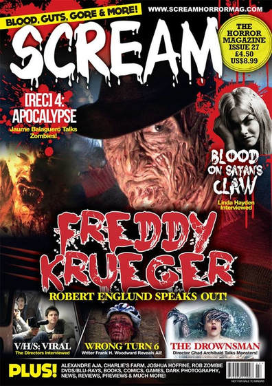
RMT EXAMPLE 3- SCREAM (Niamh Crowley)
|
|
|
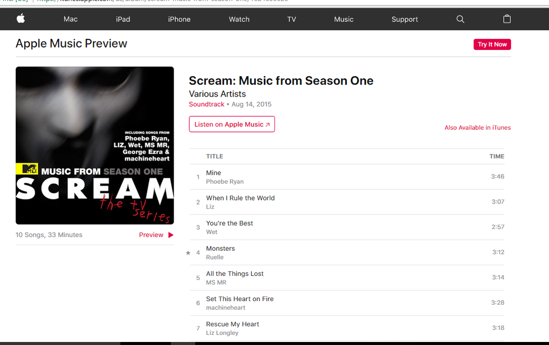
Scream is a very successful horror film franchise. After the first one made in 1996 there were three more after. The first film is the highest grossing slasher film in the United States. Scream is similar to our movie products as our trailer is also a slasher that has a masked antagonist who is out to kill teenagers.
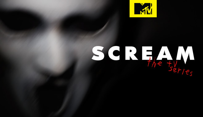
Over the years Scream has gained a lot of success as a result there is a lot of merchandise and memorabilia including a spin off MTV series. They have a strong brand which was helped by synergy and convergence, they have also released a official game.
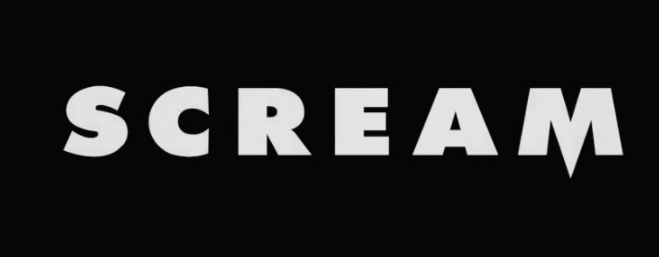
Iconography of the Scream franchise is the recognisable font that is on all four posters. As well as the house colours of red, white and black this use of the same typography allows audience to recognise and establish where the films are from.
Apart of the franchise is also the soundtrack/ score as the soundtrack from the MTV series. Cross media convergence for the the music is on iTunes.
Over the years Scream has gained a lot of success as a result there is a lot of merchandise and memorabilia including a spin off MTV series. They have a strong brand which was helped by synergy and convergence, they have also released a official game.
Iconography of the Scream franchise is the recognisable font that is on all four posters. As well as the house colours of red, white and black this use of the same typography allows audience to recognise and establish where the films are from.
Apart of the franchise is also the soundtrack/ score as the soundtrack from the MTV series. Cross media convergence for the the music is on iTunes.
|
The franchise of Scream is very well known and is referenced a lot, therefore it has a lot of merchandise associated with it. For example the costumes and mask.
Not only costumes but because of the success they made a game for phones about Ghost Face. |
Another product that came from the franchise was tbe MTV show based on scream and a direct result of this was a iTunes scream soundtrack, all this means they gain more money and more people know about the franchise.
Scream 4 was made in 2011 so with this new series they can appeal, as it's based around a cyber attack in a fictional place called Lakewood, where teenagers get targeted by Ghost Face. With the relatable characters and known actors, this TV series can draw in a new audience or people that have seen the films.
Scream 4 was made in 2011 so with this new series they can appeal, as it's based around a cyber attack in a fictional place called Lakewood, where teenagers get targeted by Ghost Face. With the relatable characters and known actors, this TV series can draw in a new audience or people that have seen the films.
TRAILER AND POSTER
By Niamh Crowley
|
Fonts: The fonts for the poster and trailer are identical and therefore create a continuity between all the product creates a brand. As they are the same font they are easily recognisable as being connected and related to each other, from the audience.
Colour Scheme: The film is based around on a house and activities that occur in it, for example the finding of the films. The opening shot of the house is pale brown and beige and these colours are similar to the movie poster. What is also similar is the title slates that occur through out that have a similar light dirty, textured background. Having the same colour scheme and textures help make it recognisable. Characters: Similar to other horror posters, the character on the Sinister poster is a prominent figure in the film. She is obviously a child and the story line of the trailer is about a figure who consumes the souls of human children. With this character on the poster it means there's still some things unknown to the audience that will make sense once they watch the trailer they will understand a bit more but there is still mystery. |
Our Product
|
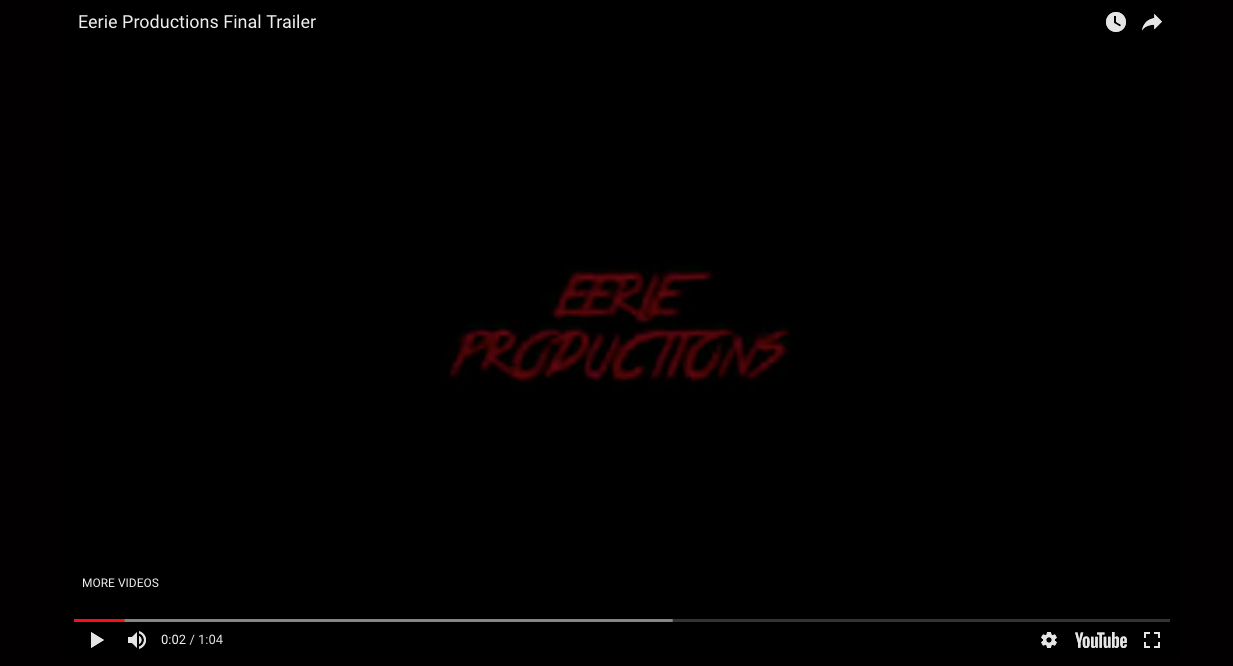
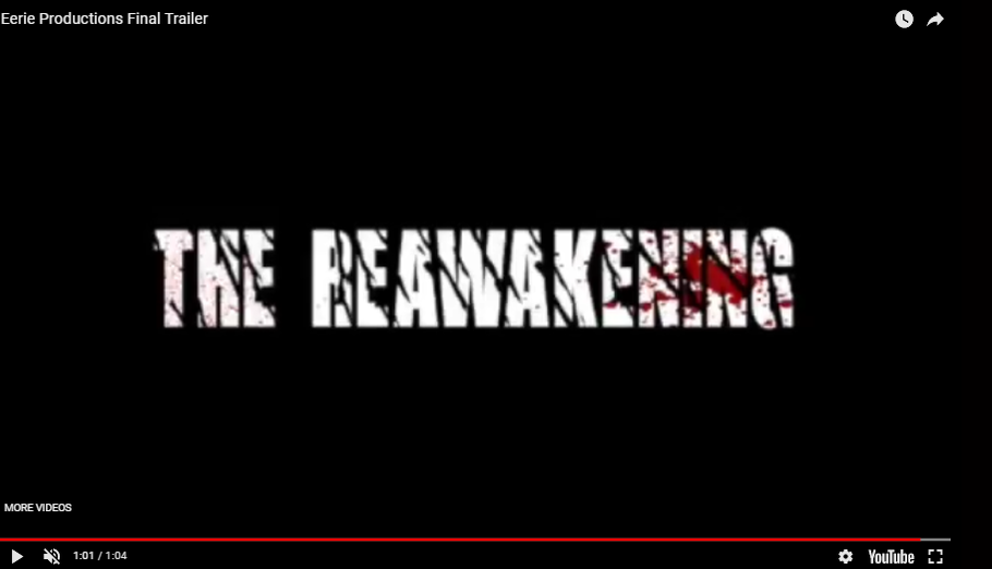
Fonts: The fonts we used in our trailer do not have a steady consistency, what we have done is for the title slates used the logo font for EERIE PRODUCTIONS instead of the REAWAKENING font. The title slate font is still a horror theme. This therefore means that the brand we are creating could be effected as audience might not be able to connect the poster and the trailer until the end where the actual title of the film is.
Colour scheme: Are colour scheme for the trailer is a mix of dark tones and some lighter shots like the one in the trailer thumbnail. The colour scheme is a bit different from the poster as we've used a red effect and have made the antagonist into a black silhouette. Despite the colours scheme not being the same the antagonist is still recognisable and is effective in creating a eerie sense of uncertainty. Character: A consistent character, the antagonist, is used through out the products. We have centred on the antagonist as, as a character he doesn't give to much information away about the storyline and leaves the audience intrigued. Because of the consistency the audience would be able to recognise that the products are linked and a brand can be created. |
|
|
|
|
TRAILER AND MAGAZINE
By Niamh Crowley
|
FONT: The font for Evil Dead is very recognisable and as this is a re-make for 2013 it's good that they have used the same font as the original in 1981 as people who watched it then can see it's the same film. The fonts are very similar as in both they are very clear.
COLOUR SCHEME: As you can see the thumbnail for the trailer and the magazine cover are very similar, the magazine has more focus on the main character as she stands out more. Because of the similarity it means there very recognisable to the audience and they can relate them together. CHARACTER: The female is the main character of the film and this is shown as she is the only character on the magazine and is prominent in the trailer. |
|
Our Product
|
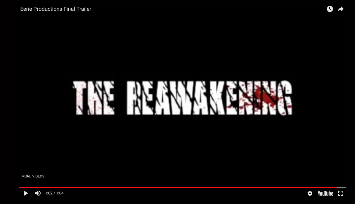
FONT: We created a continuity with the use of our title font for THE REAWAKENING, the specific font and blood splatter mean the audience can relate them to each other.
CHARACTER: The main character of the trailer is the masked antagonist, therefore he's the only character on the front cover. But also in the trailer the antagonist isn't always hidden suggesting he is powerful and not fearful. So the lighting is quite bright.
|
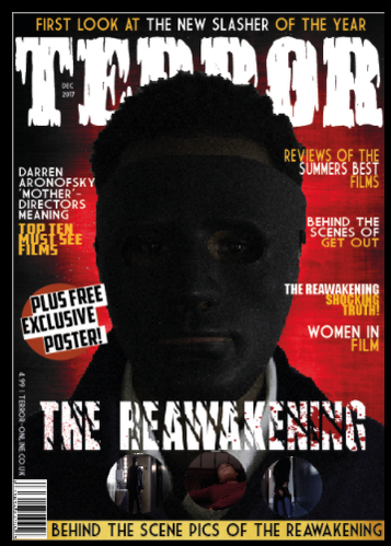
COLOUR SCHEME: There is no direct link between the colour red and our trailer, however it is similar to the poster so does have some continuity. The colour red connotes danger and associated with blood suggesting that the antagonist harms people and should be feared.
|
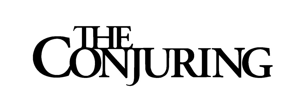
TRAILER AND WEBSITE
Cameron Elliott
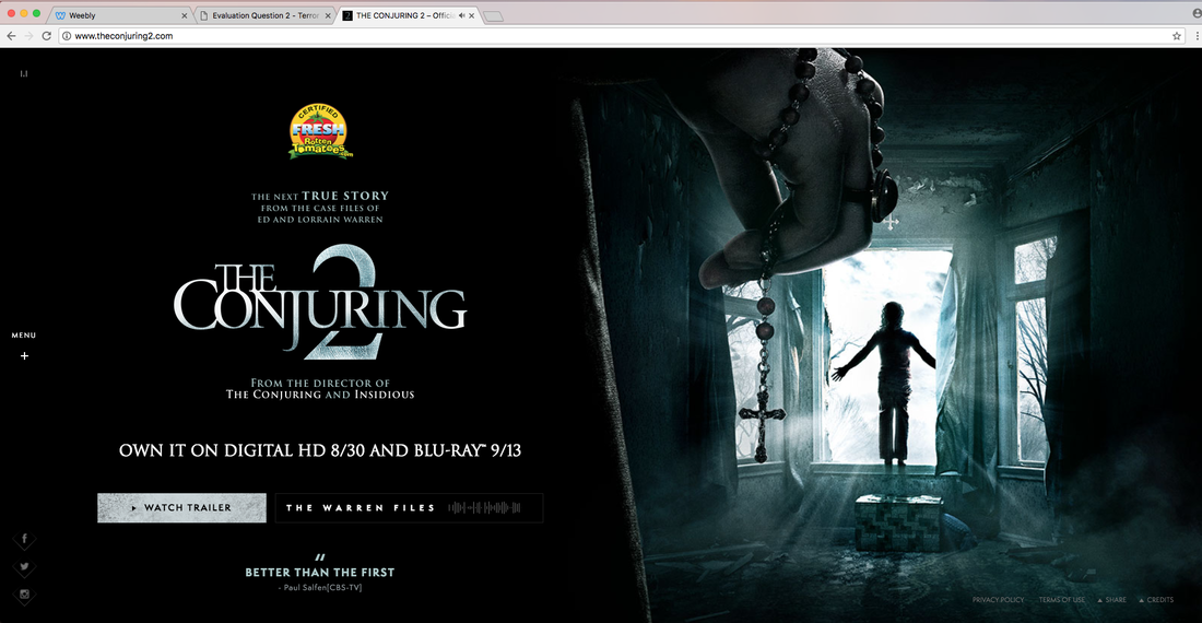
There are stark similarities between 'The Conjuring 2's Website and its' trailer. To begin, the dark and eerie themes are vividly present throughout both, giving a sense of fear and uneasiness to a potential audience. In addition, this is highly conventional of a Horror Film, and therefore any potential viewers will recognise immediately that the trailer and website are belonging to a horror film, even if they are not familiar with 'The Conjuring' series. Ultimately, the audience are also going to recognise that both the Trailer and Website belong to the same film due to the shared conventions such as:
TONES AND COLOURS- As already mentioned, both the Website and the Trailer share the dimly-lit, dark, 'moody' tones and colours. This is to inform the viewers of the bleak and dark plotline featured in 'The Conjuring 2'
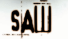
TEXT- The font used for 'The Conjuring 2's logo is the same in the Trailer as the Website. This is done to create iconography, as continuity creates iconic images/logos. This is especially important as the logo is perhaps the single most associated with a film (e.g. The SAW and Friday the 13th logos are so heavily associated with their respective films that they have become the official logo).
CHARACTERS- This is slightly different as the 'Teaser Trailer' only actually features one character (arguably 2 if the clapping hands count as another character). However, the actual trailer, shown below, features many more characters, much like the website does. Again, this contributes to iconography as often the main characters will be so heavily associated with a film series that they become an unofficial 'logo' for the film. (e.g. Voorhees in Friday the 13th, Pennywise in IT.)
TONES AND COLOURS- As already mentioned, both the Website and the Trailer share the dimly-lit, dark, 'moody' tones and colours. This is to inform the viewers of the bleak and dark plotline featured in 'The Conjuring 2'
TEXT- The font used for 'The Conjuring 2's logo is the same in the Trailer as the Website. This is done to create iconography, as continuity creates iconic images/logos. This is especially important as the logo is perhaps the single most associated with a film (e.g. The SAW and Friday the 13th logos are so heavily associated with their respective films that they have become the official logo).
CHARACTERS- This is slightly different as the 'Teaser Trailer' only actually features one character (arguably 2 if the clapping hands count as another character). However, the actual trailer, shown below, features many more characters, much like the website does. Again, this contributes to iconography as often the main characters will be so heavily associated with a film series that they become an unofficial 'logo' for the film. (e.g. Voorhees in Friday the 13th, Pennywise in IT.)
Our Product
POSTER AND MAGAZINE
Our product does not contain the profound similarities featured between 'The Conjuring 2's website and trailer, however the two aren't completely unlike. There is a lot of continuity featured in the Eerie Productions' website, and the trailer for 'The Reawakening'.
TONES AND COLOURS- In a very similar fashion to 'The Conjuring 2', we used a very similar colour palette on both our Website and Film Trailer. Dark, bleak and intimidating colours are used throughout both. This shows the audience that both entities belong to the same film, avoiding any possible confusion. In addition, the use of similar dark and gloomy colours automatically gives an insight as to the 'feel' and 'vibe' of the overall product.
AESTHETIC- While the aforementioned Tones and Colours essentially are the Aesthetic, it's worth noting that both the trailer and website share a penchant for close-up shots on an intimidating antagonist. While the website doesn't contain a shot of the antagonist, it still features a close-up on a carnivorous-looking clown to create a sense of unnerving the audience, as well as claustrophobia, with it taking up the majority of our home page.
TEXT- Unfortunately, we did not use similar text styles on both our film trailer, and the website. As a result, there isn't a whole lot of continuity and eliminates the possibility of our film logo being an iconic bit of branding.
MAGAZINE
Blesson
Blesson
|
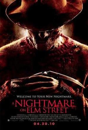
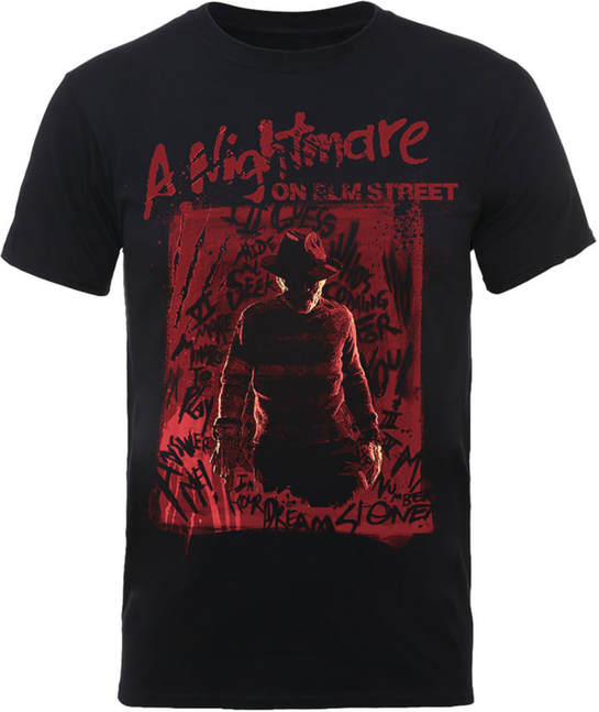
Fonts: similarly, the main text is in red but the font doesn't match. It is still recognisable as both the poster and the magazine front cover involves bold text that will capture attention first. The poster involves a serif type of font whereas the the magazine front cover is more animated and horror-like as it involves the rips. But it doesn't push the brand identity of a Nightmare On Elm Street as effectively as it could have.
Colour Scheme: The colour scheme for both involves red as the primary colour because it indicates danger, blood, violence and evil which are all elements of a horror film and definitely elements featured in our film concept, The Reawakening. Characters: the character or the main antagonist, Freddy Krueger is featured as the dominant image on both the poster and the magazine because he is the most important part of the film. You can see at least parts of his face on both even though, on the poster he is more shadowed by his hat which is probably to connote an element of mystery. On the magazine front cover, it features a close up and it shows more of his face to make him the most noticeable thing on the magazine. This also pushes the brand identtiy of 'Nightmare On Elm Street' as every movie related to that involves Freddy Krueger |
Our Product
|

Fonts: the font for the film title is exactly identical. This is to push the brand identity lof the film and make it more recognisable by the audience. It invovles blood at the end of the word ' Reawakening'. However, the fonts for other forms of text on both the poster and the magazine front cover don't match but this isn't important as long as there is some sort of brand identity in the main titles and coverlines
Colour Scheme: The colour scheme matches as the background involves red which is the primary colour of the colour scheme. This is considered a convention because like I said earlier, it indicates violence, evilness, blood etc. These are essential elements in a slasher. Also, since the background is red, it carries on the brand identity from the poster to the magazine front cover or from the magazine front cover to the poster. This is so that the audience that is intended can recognise the film well and so that we differ from any other film specifically horror films that have been released. Characters: the character that is featured on the film poster and magazine front cover is the antagonist because the antagonist makes the show and is the main reason why people watch slasher movies. Without the slasher, it isn't a slasher so it was best to make the antagonist the dominant image. This enforces the brand identity of the the Reawakening because the antagonist makes the brand. |
BRAND IDENTITY
By Niamh Crowley
|
|
|
Brand identity is about consistency through products, so that the audience is able to recognise what your different products are and how they are from the same company, this can include the tagline, logo and iconography. It is vital for films when there being promoted. This is done when are products stick to a house style, for example the consistent colours red, white and black. The examples above show how important branding can be for a franchise, all these films have sequels and merchandise as well as Scream having a spin off MTV TV show, because of the continuity in the font for the films audiences will be able to recognise that there apart of the same film series and franchise. Therefore brand identity is important as without it people may see your products but may never connect or know that the products are linked.
Our Product
|
|
Brand Identity
Not only is brand identity vital for a franchise but it also helps link the different types of company's involved. For example the production and distribution company's. It is important there is continuity with things like the logo's as people will see the logos and recognise it and then make assumptions about the product, if the company is recognisable and famous audiences will be comfortable with it and trust that the product is good.
Subsidiaries
Eerie Productions: Television
Eerie Production Television, is another way that our franchise is bigger. Because of this we will be able to make more money and promote our brand as a Production Company. The channel will be available on all major television companies like Sky, BT and Virgin. With the use of the logo it will be recognisable to audiences that watch the channel, which will broadcast horror shows as well as behind the scenes content, as well as the film products. With the consistency people will be able to find more products that Eerie Production creates. Therefore the use of this cross-media convergence will help grow the brand of Eerie Productions.
Eerie Production: Records
The musical department of Eerie Productions comes in the form of 'Eerie Production Records'. This is another instrumental way of our company branching out into another industry in order to ensure both financial and commercial success. The official soundtrack of 'The Reawakening' is available on iTunes, Spotify and TIDAL under the 'Eerie Production Records' banner, hopefully allowing the soundtrack to grow interest in the film, in a similar way to the soundtracks of both Trainspotting (1996) and JAWS (1975). Again, this use of Cross-Media Convergence will enhance the Eerie Productions brand altogether.
Eerie Productions: Interactive Entertainment
'Eerie Productions: Interactive Entertainment' is the gaming branch of the conglomerate 'Eerie Productions'. The gaming industry is a thriving one, experiencing a 'boom' in recent years. Therefore, it makes absolute sense to make a game of the film, akin to other similar horror film-inspired games, such as the frequently mentioned Friday the 13th (Game made in 2017), as well as SAW (2009). The official game of 'The Reawakening' is released in early 2018, to be made for the Xbox One, PS4, and also PC. Again, many people who play games but don't watch films will be introduced to 'The Reawakening' in this manner, therefore growing the brand of the film franchise through the gaming industry.
OTHER EXAMPLES OF SYNERGY
WIKIPEDIA
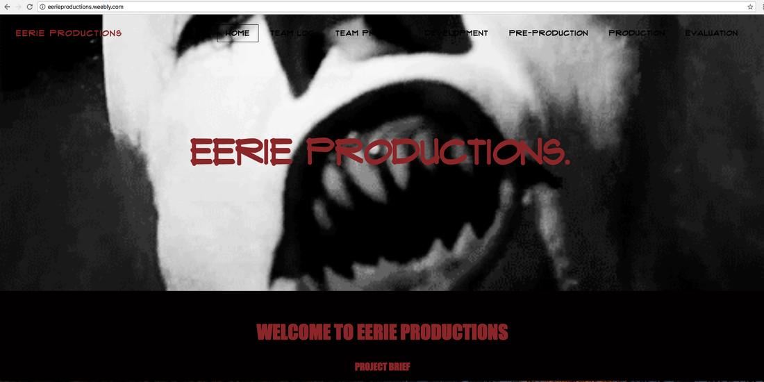
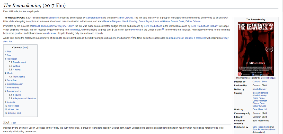
Below is a screenshot of the Wikipedia for our horror film 'The Reawakening'. I made this page highly authentic and representative of an actual Wikipedia page, complete with the typography, grammatical style, layout and language of a genuine Wikipedia article. This page gives a potential audience all of the required information to do with 'The Reawakening', including the names of the Director, Actors, Distribution and Production companies. It also features the official release poster, and a brief summary of the Film's impact and legacy in a modern society.
Below is a screenshot of the Wikipedia for our horror film 'The Reawakening'. I made this page highly authentic and representative of an actual Wikipedia page, complete with the typography, grammatical style, layout and language of a genuine Wikipedia article. This page gives a potential audience all of the required information to do with 'The Reawakening', including the names of the Director, Actors, Distribution and Production companies. It also features the official release poster, and a brief summary of the Film's impact and legacy in a modern society.
PHYSICAL ADVERTISEMENT (BILLBOARDS)
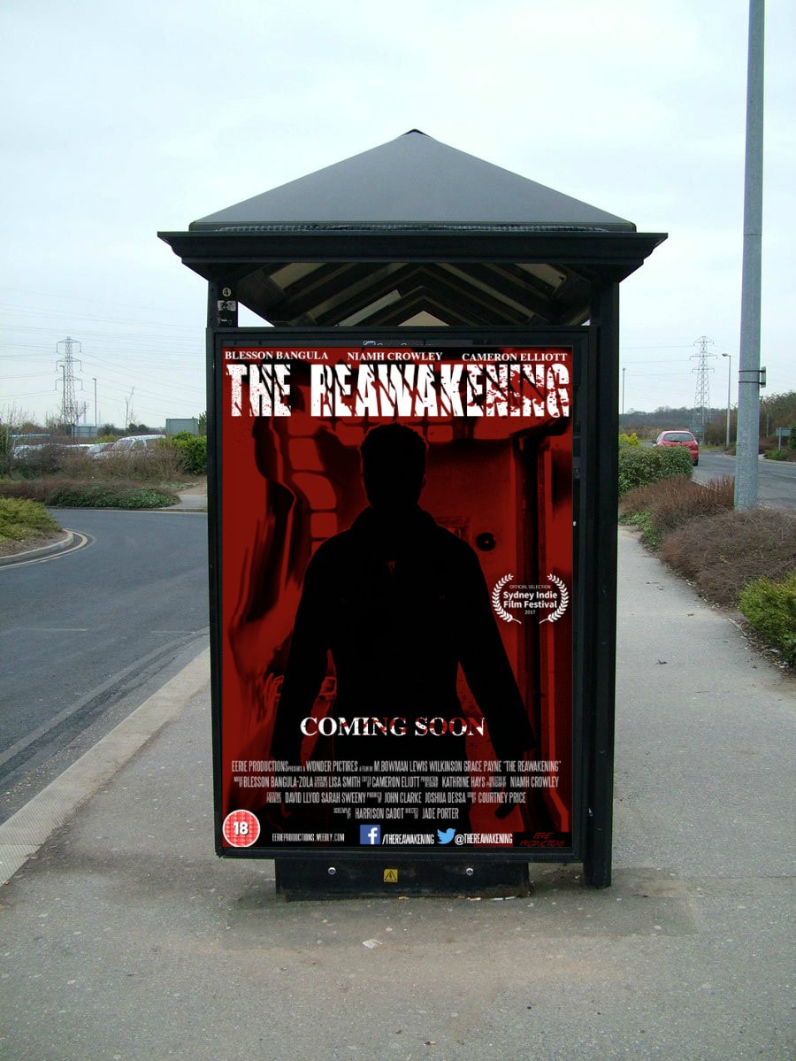
Physical Advertisement is perhaps the most important of all types of advertisement as it will receive the most attention from the general public. Below is the example of Physical Advertisement used for 'The Reawakening'. I made this highly authentic also with the sizing of the image fitting with the bus-stop billboard shape.
Physical Advertisement is perhaps the most important of all types of advertisement as it will receive the most attention from the general public. Below is the example of Physical Advertisement used for 'The Reawakening'. I made this highly authentic also with the sizing of the image fitting with the bus-stop billboard shape.
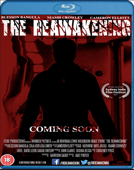
BLU-RAY COVER
Blu-Ray has rapidly become the primary way in which films are physically bought and consumed in recent years. Our film needed to be released on Blu-Ray to ensure maximum exposure for the product and also to engage the largest audience we possibly could. I used Adobe Photoshop to create this Blu-Ray cover, in order to make it as authentic as possible, as if it was a genuine media product.
|
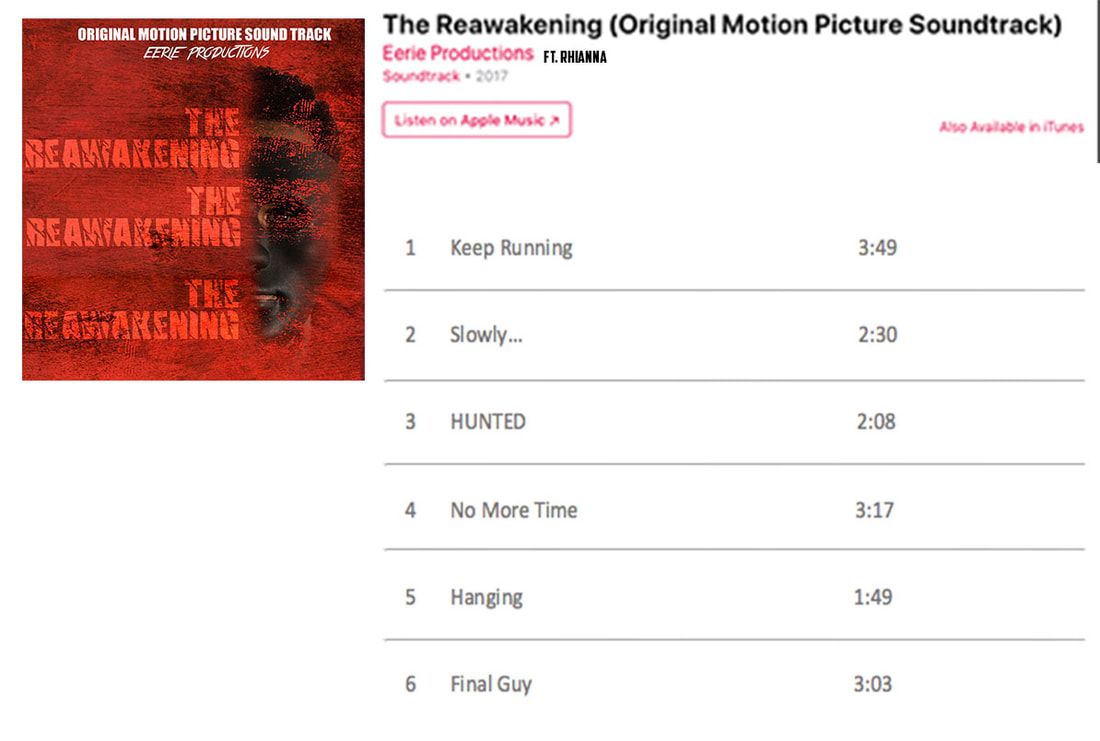
This is the original motion picture soundtrack for The Reawakening which is on iTunes. The soundtrack will most likely not be sold as physical copies in shops like HMV however can be apart of a soundtrack that has an assortment of horror film songs.
|
|
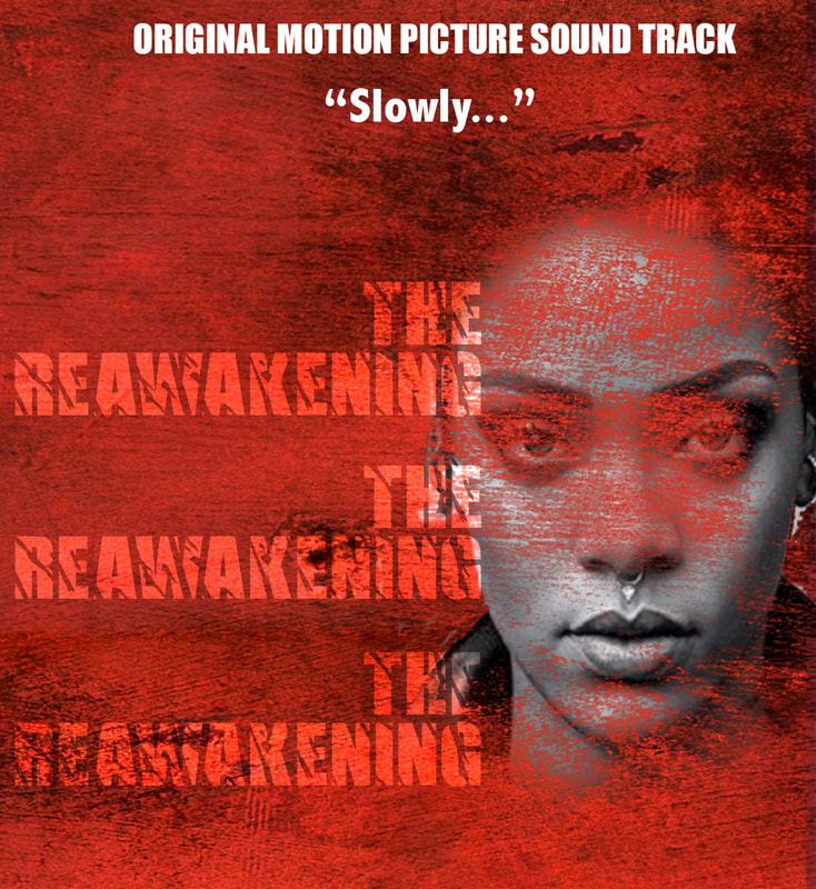
The main artist on our film is Rihanna as she is signed to "Eerie Records", the most popular song being "Slowley..." .
There is different elements that make up the album cover, that links in with out brand. Instead of having a mask we have scratched out some of her face using Photoshop so that it not only has a texture effect but still has some elements of mystery. As well as having a red texture background which is the same in the magazine and poster, which helps create the brand identity because there all so similar and recognisable.
There is different elements that make up the album cover, that links in with out brand. Instead of having a mask we have scratched out some of her face using Photoshop so that it not only has a texture effect but still has some elements of mystery. As well as having a red texture background which is the same in the magazine and poster, which helps create the brand identity because there all so similar and recognisable.
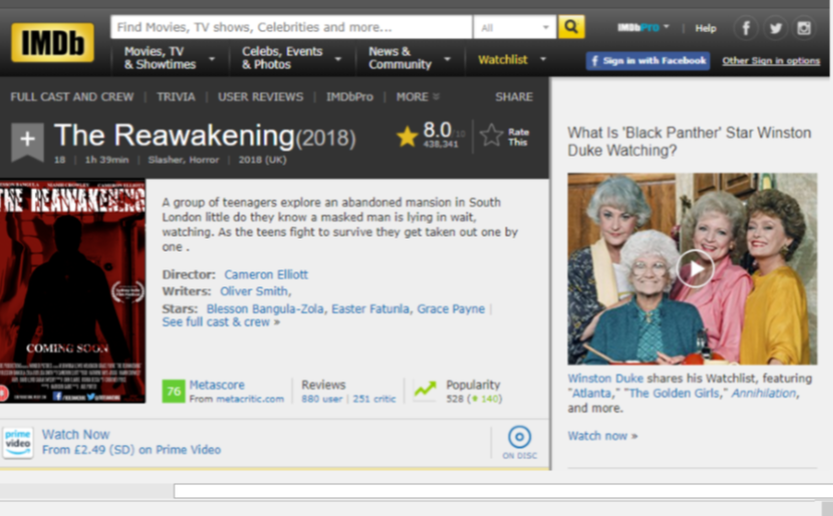
This is our IMDB for The Reawakening. IMDB is a online database for information about films and television across the world. With 83 millions registered users, and millions of users as it's the 52nd most used website, it made sense for are film to be on here. We have created continuity as the poster is the same on the website and for are actual poster. This therefore means it's recognised easily and people can see it's for the same thing.
Merch Website
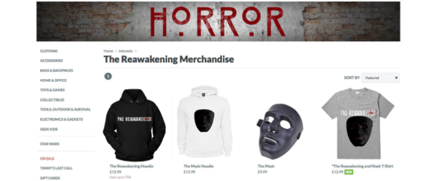
This is a screenshot from Reawakeningmerch.com where we sell branded clothes and other items like the iconic mask in the trailer. The colour scheme fits with our house style as it has red and black and some white and grey. This therefore also helps with are brand identity because the colour scheme is linked and recognisable. Another connection can be found as they are all the same logo and images used in the trailer.
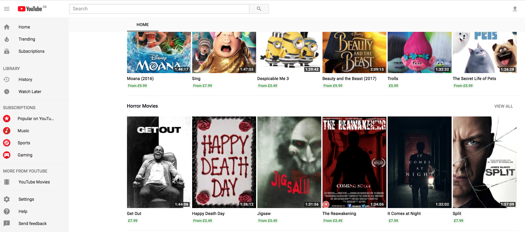
YouTube Movies
Are film is available to buy and rent on YouTube which is a video sharing site that has 5 billion videos watched every day. This makes is a perfect site to promote our film as it can have a wide audience from all over the world. Not only this but if people are watching one horror film then are film can come up as a suggestion, therefore creating more of an audience. This helps with brand identity as were not only using traditional forms of media like bus adverts but are appealing to a new type like YouTube.
