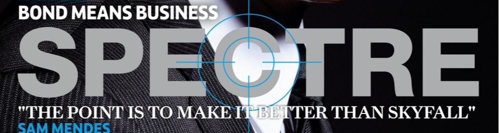
A horror genre can be made recognisable with the use of conventions which allow meaning to be created. They can be recognised by things like symbolic codes, like a knife representing phallic imagery and male dominance. With doing a specific sub-genre it has to live up to what the audience are expecting as they have chosen to watch it. In order to keep the audience interested there has to be an element of development and evolution in the genre. From looking at real media texts you can see the changes of types of characters or the representation of men and women in horror. Another convention of films and real media texts s the narrative structure that is followed, for example Todorov's three act structure. Equilibrium, disequilibrium and resolution. Because the product we are creating is a trailer we do not show a resolution as the purpose is to keep the audience intrested and intrigued with a result of them wanting to watch the film.
Within this evaluation question we will explain the reasoning similar to the examples above to why we decided to follow, challenge or use the conventions of other horror products we have looked at.
Within this evaluation question we will explain the reasoning similar to the examples above to why we decided to follow, challenge or use the conventions of other horror products we have looked at.

TRAILER
By Cameron Elliott
TODOROV'S THEORY
Like many others, we used 'The Conjuring 2' as an example for the timing and shot selection of our horror trailer. We utilised a similar structure to 'The Conjuring 2' with regards to Todorov's theory also.
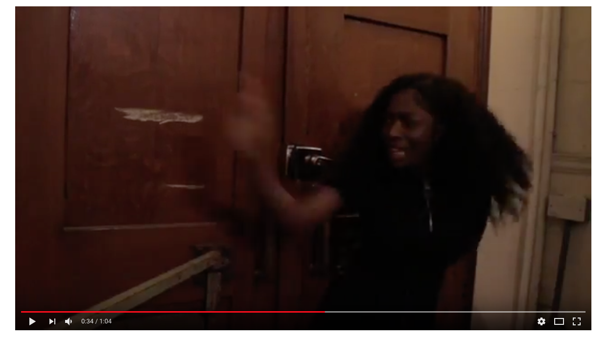
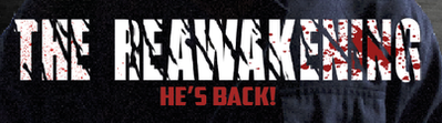
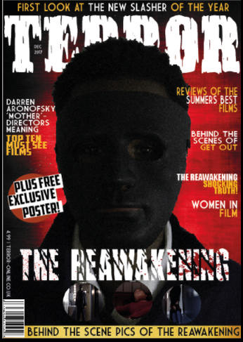
THE REAWAKENING (OUR TRAILER)
EQUILIBRIUM- Not explicitly clear if there actually is an equilibrium in our trailer as the shots are dark, eerie, and gloomy from the outset. However, the first 10-15 seconds represent an equilibrium of sorts, with no real action happening in that time period, which is taken up instead by texture shots of the house and surrounding forest.
DISEQUILIBRIUM- The Disequilibrium comes in the form of the antagonist rising from his crypt. All the adversity in the trailer is as a result of this scene. Rapid cuts ensue to enhance the fear factor of this part of the trailer.
RESOLUTION- Again, this trailer doesn’t have a clear ‘resolution’ as the ending is completely ambiguous. However, one possible reading of the ending is that the villain is vanquished by the ‘final male’ character.
THE CONJURING 2 (RMT)
EQUILIBRIUM- An old looking house. A woman hears a noise and goes to see what is the cause.
DISEQUILIBRIUM- Unusual occurrences keep taking place elsewhere in the house such as the clapping hands behind the woman on the stairway and the child's toy seemingly turning itself on with no intervention.
RESOLUTION- Similarly to our trailer, 'The Conjuring 2' doesn't feature a clear resolution in its teaser trailer. We copied this idea to make our product as authentic and close to a Real Media Text (RMT) as possible.
LENGTH OF TRAILER
We used a Real Media Text to model the structure of our trailer upon. Most real horror trailers are around a minute or two long, with the vast majority clocking in at just over a minute. We modelled our trailer on the aforementioned ‘The Conjuring 2’ teaser trailer, which clocks in at 1:23 in length.
Not only did we use 'The Conjuring 2' as inspiration for our total runtime for 'The Reawakening', but we also modelled the timing of the respective Todorov sections on that trailer also. Like 'The Conjuring 2', our equilibrium lasted for roughly 15-20 seconds before flowing into the Disequilibrium, which also lasted for roughly the same amount of time. However, unlike 'The Conjuring 2', we used the ending of our trailer, and the last 20 seconds or so to feature a rapid-cut filled montage to build the excitement and intensity for our film.
The Conjuring 2- Teaser Trailer (Length)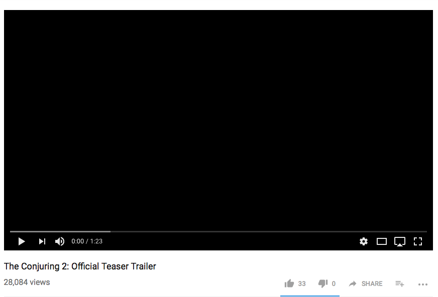
|
The Reawakening- Teaser Trailer (Length)
|
FILM SETTING AND LOCATION
In order to make the film as authentic as possible, I wanted the film to be shot in a very typical Horror Film setting. The shots were taken primarily in three extremely contrasting locations: Beckenham Place Park House, Lesnes Abbey, and finally Deptford Police Station. Beckenham Place Park House was particularly conventional as the majority of horror films include the presence of a big, grand, old mansion similar to the one we used. Any basic audience would therefore associate the setting with a horror film, therefore making it instantly recognisable and therefore effective. There was slight contrast however, as Beckenham Place Park Mansion is a large property, standing alone in a large field rather than the tight and enclosed nature of the semi-detached property used in 'The Conjuring 2'. The choice to use a much larger and open property was made to enhance the agoraphobic, helpless nature of the plotline. The victims looked small and unimposing compared to the surroundings, enhancing the 'scary' nature of our trailer.
Similarly, Lesnes Abbey was quite a typical location for any horror film trailer. It was particularly effective in our trailer due to the fact it resembles a graveyard, and the trailer itself hints at the fact the antagonist is undead. Much like the previous location, Lesnes Abbey is instantly recognisable as a horror location and therefore any basic audience would realise from the outset that 'The Reawakening' is indeed a horror film.
Finally, and possibly the most unusual and/or atypical location used by my group is Deptford Police Station. This was perhaps the most effective setting that we used due to the subtext of this location. Usually, Police Stations are responsible of the upholding of justice and good. The fact that the majority of the incidents take place here is particularly unnerving to the audience as it shows that absolutely nowhere is safe from the Antagonist. This is also similar to 'The Conjuring 2' which takes place in a home, another place where most people would feel safe and protected from evil.
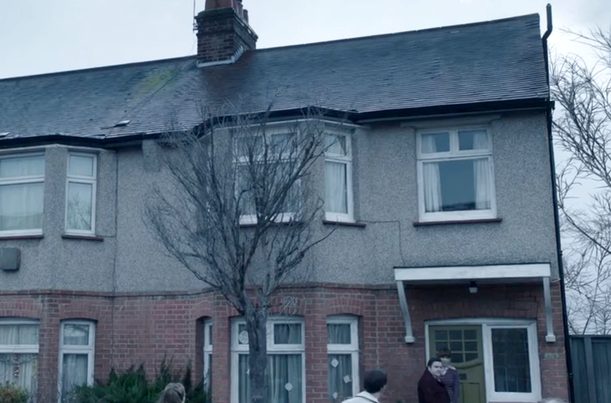
The Conjuring 2 House
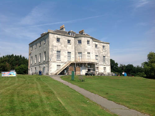
Beckenham Place Park (The Reawakening)
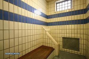
Inside of Deptford Police Station (The Reawakening)
ANIMATIC REVIEW
As shown by a comparison of the actual trailer and the animatic, we deviated from the planned shotlist to a degree. The reasoning for this is mainly because we felt that the original amount of different characters and scenes would be too confusing for the audience, and it would also mess up the continuity of the trailer. Real Horror Trailers do not feature an extortionate number of characters and shots for this very reason, and by replicating this we are making our product as realistic and authentic as possible.
However, we stuck to the basic plotline of the animatic in order to keep the narrative similar to what we had done the pre-production work on, specifically the audience surveys. It also helped us frame the trailer well, remembering Todorov's theory at all times in order to heighten the realism and authenticity of our work.
However, we stuck to the basic plotline of the animatic in order to keep the narrative similar to what we had done the pre-production work on, specifically the audience surveys. It also helped us frame the trailer well, remembering Todorov's theory at all times in order to heighten the realism and authenticity of our work.
TITLES
Similar to 'The Conjuring 2' which served as the inspiration for our horror trailer, we featured titles throughout the final piece. These titles were mainly used to show 'other' films that had been made by our production company. Overall, this displays clearly to the audience that we are an established and 'A-List' film company who know exactly what they're doing. A potential audience will therefore be enticed to watch our film more because of our storied experience in film-making. As a contrast, however, 'The Conjuring 2's trailer features title slides with the aim of narrating the trailer, hence why there is many more title slides in 'The Conjuring 2' trailer than in our product, 'The Reawakening'. Another reason for 'The Conjuring 2' featuring more title slides is due to it's length, clocking in at 2:36, whereas our product is less than half that, being 1:04 in length.
In a similar fashion to 'The Conjuring 2', I ensured that all title slides had continuity by using the exact same scrawly red font. Nearly all Real Media Texts replicate this idea to ensure that no title slides look 'out of place' or from another trailer. It also contributes to the idea of 'Brand Identity' as a certain font, with enough use, will become associated with a media product such as a horror film.
BELOW- Titles that are used in the trailer for 'The Reawakening'.
BELOW- Titles that are used in the trailer for 'The Conjuring 2'.
CAMERA WORK
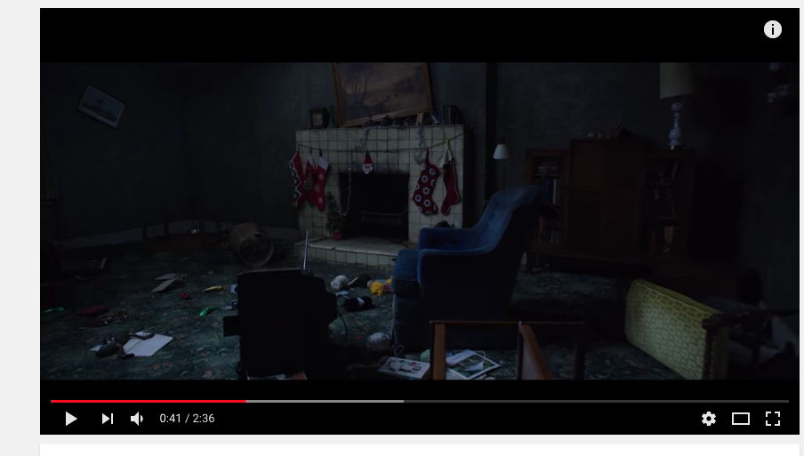
Our horror film trailer was also directly comparable to real media texts with regards to the camera work also. For example, the heavily referenced 'The Conjuring 2' has an establishing shot of the unnerving, but somewhat serene and calm scenery near the beginning of the trailer, which is an idea replicated in our trailer. (LEFT- THE CONJURING 2) (RIGHT- THE REAWAKENING)
|
|
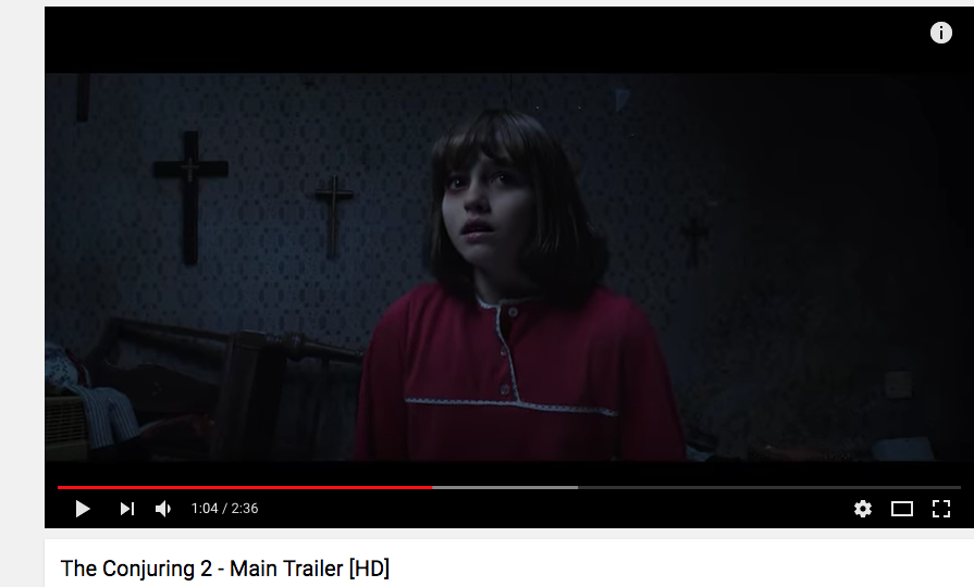
Also featured in 'The Conjuring 2' is multiple instances of shots depicting a terrified, panicking victim with no visible antagonist. The most profound instance of this is at the 1:04 mark, wherein the little girl in shot has an incredibly worried expression due to the moving crosses in her room. We decided to replicate this idea by having a victim overwhelmed by fear caused by banging on the doors, presumably by our antagonist. I feel like the two share the same effect by not including visible sight of the villain, creating a climate of uncertainty for the viewers who are now invested in the trailer, wanting to see what is causing the panic from the victim. BELOW are the two examples. (Left- The Conjuring 2) (Right- The Reawakening)
|
|
MAGAZINE
By Niamh Crowley
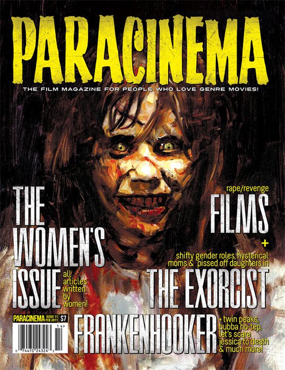
MASTHEAD
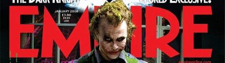
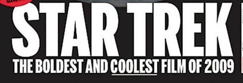
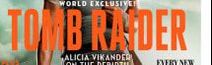
A masthead is used at the top third of a magazine page and is the biggest piece of text. We chose to follow this convention as it makes it easier for the audience to read. The font is in a horror font that I downloaded from DaFont that says ‘Terror’. The use of this font lets the audience know that it’s a horror magazine. The fact that it’s on a white text on a dark background makes it stand out and easier to read. A conventions we chose to follow was having a part of the dominant image overlap the masthead to show that the magazine issue is centred around are film and brand of film. We chose to follow the conventions so that are magazine looks realistic and like other magazines and therefore professional.
|
OUR PRODUCT:
|
|
|
REAL MEDIA TEXTS:
|
COVERLINE
Another convention we chose to follow was the main coverline for are magazine. This is featured in the lower third of the magazine cover. The coverline is the title of our horror film and is the same as the trailer and poster so that it creates a sense of a brand. The main coverline is the second biggest font on the magazine and will therefore draw in attention. This will let the audience see that the dominant image is related to the coverline as it’s over it and centred.
|
OUR PRODUCT:
|
|
|
REAL MEDIA TEXTS:
|
CHARACTERS
Another convention we followed was having only one character featured on the magazine. We used the antagonist who also wears a mask, this creates a sense of mystery and makes his identity and how he relates to the film as uncertain. The shot is a close-up which is also another convention of real media texts. As we use low-key lighting the direct mode of address will make the audience feel uneasy as they don’t know who’s looking at them.
OUR PRODUCT:
|
This is an example from our actual trailer, that shows how prominent the masked antagonist is. This is the reason he is on the magazine cover. With the mask and shadow figure he creates a sense of mystery that will draw in the audience.
|
|
REAL MEDIA TEXTS:
|
|
|
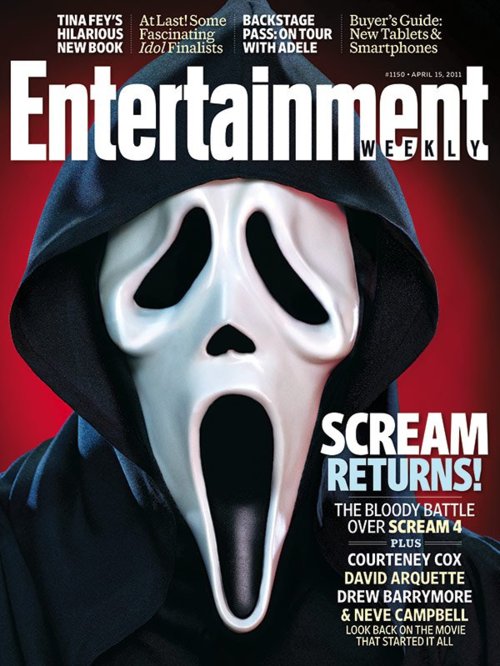
Ghostface is still recognisable as the antagonist from the Scream films. Along with IT which has been able to be remade after 20 years and is still recognisable to the audiences who saw the original. These are a good example of how a franchise has utilised the character as the Brand Campaign and is the face of the campaign. Because of this we have used this convention in the hopes that a similar iconic character will come from it much like the films above.
BOOST/ADVERTISING

Using a boost is also another convention of magazines. It usually advertises the magazine contents. In order to make this stand out I have the bottom circle a different colour then the house style of the magazine, I used a red and orange colour with white and black that all contrast each other. This will attract the audience and will show that they also get a mystery poster when they buy the magazine and this is the reason we chose to follow the convention
Secondary images
The use of secondary images is not a convention on all magazine media text we have looked at, however I felt that I wanted the audience to see some snap shots of what they can expect from the film.
|
As we can see here, this is an example of a real media text not having secondary images. The purpose of only having one is to make all the attention of the dominant image connoting a sense of importance and dominance. The reason we Chose to have secondary images is because it allows the audience to have a better judgement of whether they want to watch it or not. Not only this but it makes them look closer at the magazine and the article about it if they find it interesting.
|
|
|
In this example there is some use of secondary images, however not in the same way that are magazine uses the.
We have used the convention of secondary images and developed it into what we wanted. This was buy drawing more attention to the film and it's brand as the purpose of the magazine issue is to promote the film. Therefore buy using the three images like we have we are promoting more of an idea of what the audience can expect. 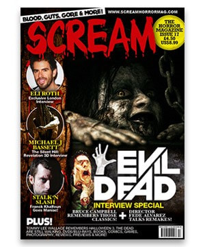
|
Conclusion: Overall I think we followed main conventions of real media texts, such as the spacing like the rule of thirds, masthead and coverline. We chose to follow the conventions to make it easier for the audience and make it reconcilable as a film/horror magazine. We also chose to include secondary images at the bottom in order to entice the audience as they give snap shots of what they can expect from the film.
HORROR GENRE
By Niamh Crowley
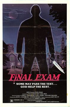
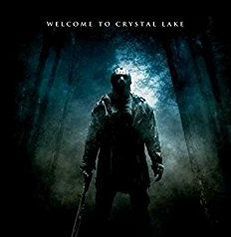
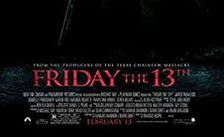
Are film trailer genre is slasher. We follow specific conventions that make it recognisable as a slasher. And also we've taken inspiration from real media texts like Psycho, Scream and Friday the 13th.
|
|
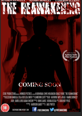
The real media text poster is on the left and our product is on the right. You can clearly see that they are of the same genre. The dominant image of both of them connotes a sense of mystery as they are made into a black silhouette it creates a feeling of uncertainty of who the male figure is. The distortion of the background for The Reawakening conveys confusion and blurriness which gives suggestions to the audience of the character the antagonist is.
Slashers give a depiction of a world where your never safe from a masked murderer and that you can be easily overpowered by this other force who can control you and has the strength to murder you. In the trailer with the use of screams and cuts to black as well as some low angle shots, we create a world where the teenagers are not safe and there actions have consequences.
It can give suspense to some audience who use the trailer to there advantage and can allow them to escape there own world to be submersed into a world of suspense, thrill and excitement that they don't experience in there lives.
With our trailer we leave some purposeful open ended scenarios whereby you don't know the reason why these teens are being hunted, but with the scenes with the protagonist being chased it allows the audience to make there own endings up but for them to also want to come and see the film so they get there proper answers.
POSTER
By Blesson Bangula-Zola
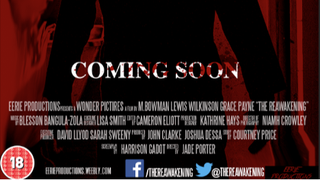
FILM TITLE
|
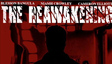
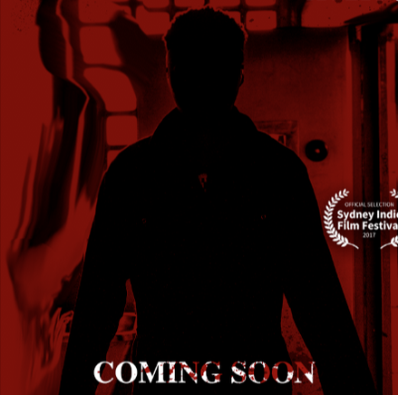
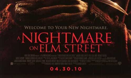
On our film poster, we used the conventions by applying a film title. However, we positioned the film title at the top of the page unlike other horror posters as they position their titles at the bottom which is more common; in others I challenged the conventions of real media texts in that aspect. Also, I challenged the convention of keeping every text in the same font; on my poster, the coming soon text is very different from the film title. I put the coming soon text in a serif type of font whereas the the film title is in a sans-serif type of font. Also, I developed the convention by applying blood to the film title which isn't often seen on horror posters. At the same time, I challenge the convention of the film title being red; my film title is white because my dominant image is red so I needed the title to still be noticeable. Also, I wanted to add my own flavour to it too.
|
|
SUBJECT/IMAGERY
|
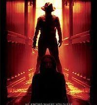
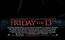
On our film poster, we used the convention of the dominant image involving the antagonist; this is seen in many slasher films poster (e.g. a Nightmare on Elm Street, Friday the 13th, April Fool's Day etc). I developed the convention by making the antagonist appear as a silhouette which adds this mysterious vibe to the poster. In addition, it also makes the antagonist seem powerful especially with the stance they are in with the arms out. However, I didn't follow the convention of taking a low angle shot like the Friday the 13th & A Nightmare on Elm Street. The low angle shot is essential to make the antagonist appear very big and powerful. This is so that viewers know what they are getting into. I also used the convention of the colour scheme involving red which is also evident in many slasher posters because it represents blood since it is a slasher meaning there is going to be a lot of violence.
|
|
|
|
BILLING BLOCK/CREDITS
|
On our film poster, we used the convention of a billing block which involves the credits of the film. We applied the billing block to give credit to all that worked on the film project and the trailer. This is a similar style to the billing block on the Friday the 13th poster so we used the style of the conventions but didn't develop it. However, as a part of the billing block, there's normally notable actors and actresses. For example, on the Friday the 13th poster, you can see notable actors such as Danielle Panabaker and Jared Padalecki which both star in the movie. This s so that fans of actors like them can go watch the film; it also shows the level of the budget that the producers have meaning the film is going to be good with good actors that are known for the good performances. However, I didn't use this convention because my budget was insufficient to afford actors like the ones mentioned before
|

|
RELEASE DATE/COMING SOON
|
On our film poster, I applied the coming soon line. Normally, a poster either has the release date or coming soon so I used a convention. In addition to that, I developed it by adding the blood to the text to make it look more gory and gruesome. Also, it gives an insight as to what the movie is going to involve: violence and a lot of blood. We also followed a convention of the type of font; it's normally in serif font but can be in sans-serif font too. However, on a slasher movie poster, they tend to make the release date and the film title by making it the same shade of red. This is to connote the antagonist and how evil they are. It also represent blood from the violence. I challenged this convention by making the dominant image appear red and the coming soon/film title appear white. This is to have the same effect but add my own originality to it.
|
|
CONCLUSION
To conclude, a lot of the posters has inspired us to use the conventions that they use because it has now become the standard. However, there were certain conventions that I developed and challenged because that way, I can apply my creativity to it and make it original or else, it would just be a carbon copy of other posters.
